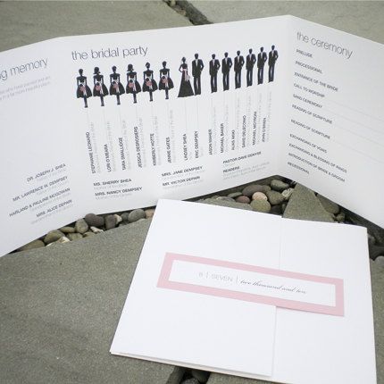
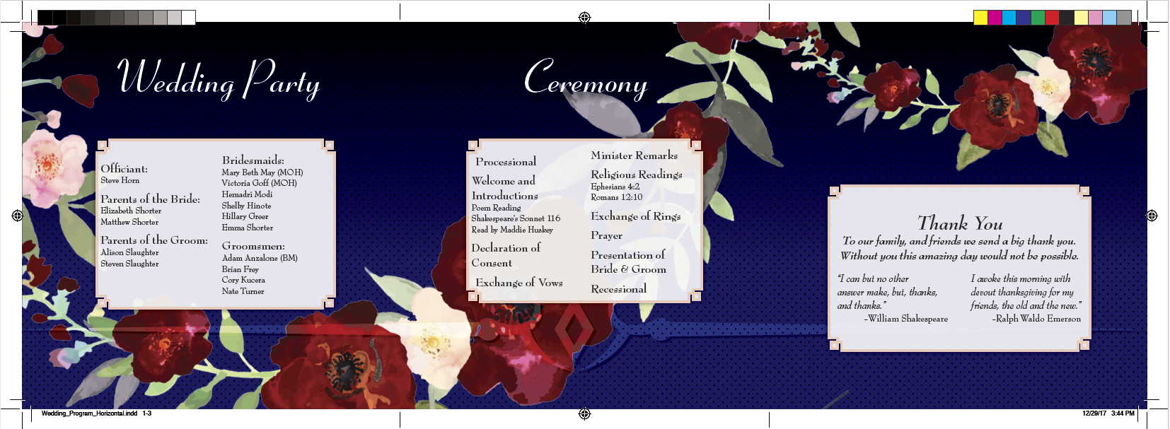
I have had questions on how do i put together a custom print materials with custom sizes and graphics that take advantage of the folds of the paper. Like the image below for example:
I have created wedding programs such as this one in the past, however, after 4 years i though it would be good to put up a tutorial since i am still been asked, how do you put something like this together. So here it is.
For this tutorial i will show you how to create a custom page size, align all pages next to each other to create the 3 panel layout like in the image above, the process and techniques i use to edit images that will go in the layout and the layout of the print material
I took the time to create this tutorial to show Step by Step how i go about putting these kind of projects together. Everybody has their own way of doing things. And this is just my way i go about it. I focused on creating files that are super editable so you can make adjustments and changes in seconds. This however requires lots of styles, working with master pages and so on. So let me show you how to go about creating a wedding program. The steps below assume that you already have working knowledge of adobe indesign. If you are looking for adobe indesign training i would highly recommend Lydan.com. I have Used lynda.com for over 7 years, i do about 60-80 hours of training per year. I don't know where i would be without it.
All of the images used in this tutorial are provided via https://stock.adobe.com/
Step one of this project is to agree on a finished size. I like for the brochure to be no wider than 15 inches, this would means each panel would be 5 inch squares. You are welcome to change this to what you want your layout to be. For this tutorial I went with a 12 inch layout, which means the panels will be 4 inches by 4 inches. I will show how to adjust the page size to 5 by 5 at part of the tutorial.
Step 1 ( document/page setup):
Created a new document in adobe indesign that measures 4" by 4". Again, i will show you how to adjust the page size a part of the tutorial.
Facing pages can be checked on. and you may add your page bleed, i go with 0.125, you may contact your printer if needed to confirm this will work for them. i find this works just fine.
As you see per my screenshots below and and above i started with just one page. The reason for that is that if you try to add new pages, they will not align next to each other they way we will need them. And this is the first trick. if you go to the pages panel you will find a couple of options that are checked, these options are called "Allow document pages to shuffle" and " Allow selected spreads to shuffle". For some reason, when they are checked, they are off. I know.
After these options are unchecked, you will be able to add pages to your layout, and drag them/connect them with each other using the pages panels.
When you drag each page next to each other working from the pages panel you should have a document that looks like the image below. I took the time to label this screenshot so you can start getting an idea of the architecture of the layout. In the screenshot below i am showing you what i call the outside spread. Now that we have completed the outside spread, we can just select all 3 pages from the pages panel and duplicate them. Now you are done with the page set up portion of the project.
Step 2 (image editing):
Highly recommend using adobe stock for purchasing images, Specially now that you can purchase 3d graphics that can be modified/edited using Adobe Dimensions. Opens new capabilities for designers and i will be showing tutorials for adobe dimensions in future posts.
For this project i used .jpg (high resolution) illustrator of watercolor flowers. I removed the photo from its white background by going to blending options and lowering the values for this layer from right to left for the whites. Take a look at my photo below:
For the next step i went to select, and color range. I used the sample tool to select only the pinks and red color values found in the photo.
Once out of the select color range panel, i saved my selection so i could load it and use it as a mask to make any adjustments i needed.
In the screenshot below it shows how i took the selection created from the color range panel and made a mask with a hue/saturation adjustment layer
In the screenshot below i show the color adjustments results, The flowers went from a light pink to deeper reds. I clipped the adjustment layer and made it into a group just to keep things organized.
Step 3:
Now is time to bring our images into the layout.
In the screenshots below i show how i placed the images in to the layout. The text frame is set up to be a two column layout and i have an object style set up incase i need to adjust my gutter space.
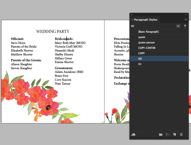
In the screenshot below i show how i took the time to create paragraph styles. This is very important to be able to make edits in seconds as you decide you want to play around with different fonts. Since its a wedding, i recommend trying out different fonts to find the best match for the personality of the event. I use suitcase fusion 7 as my professional font manager. It has an interface designed to allow you to quickly view/ compare different fonts install in your computer.
This layout contains a tile which will have a special treatment. The remembrance section of the program will sit on a color background ( red) with a inner shadow effect, white text formatted with styles and the overlapping of the flowers. Please see below for screenshot:
I gave a two column frame with a fancy corner option (see screenshot below). Remember to update your object style so all other panels update automatically.
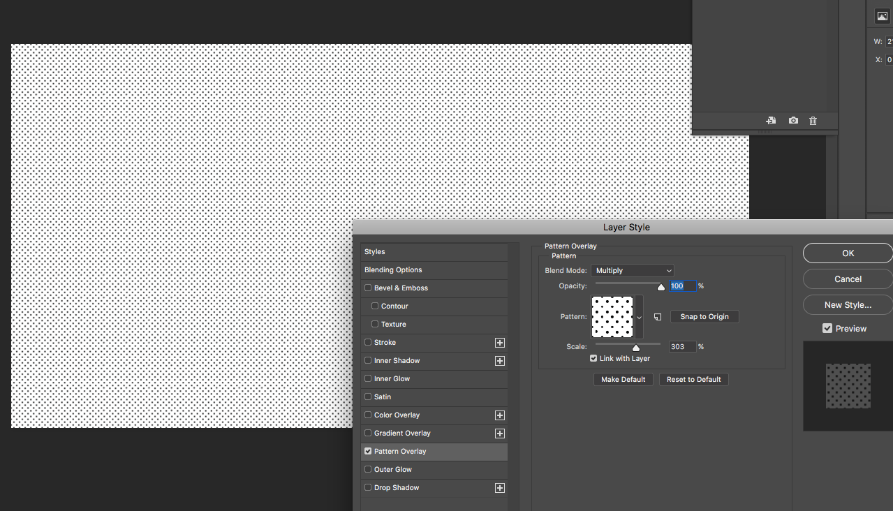
In to photoshop, made a you document. 11 by 17 at 300dpi, fill with white. Created a pattern fill background overlay, see screenshot below. This patter will be used to create a nice blended background for the inside spread.
I added the fancy corner and made a new object style a few screenshots back, and i gave it a color, i also gave that frame a drop shadow in the screenshot below. Again, you can just update the object style and it will automatically update all other frames. So its easy to play around with options and see things update in seconds for the entire layout on its own.
I also filled the page with a deep blue color, added the patter made in photoshop and applied an overlay effect so things would blend with each other. I placed the flowers on top of the layout and below you will find screenshots of all of these steps into 3 visuals.
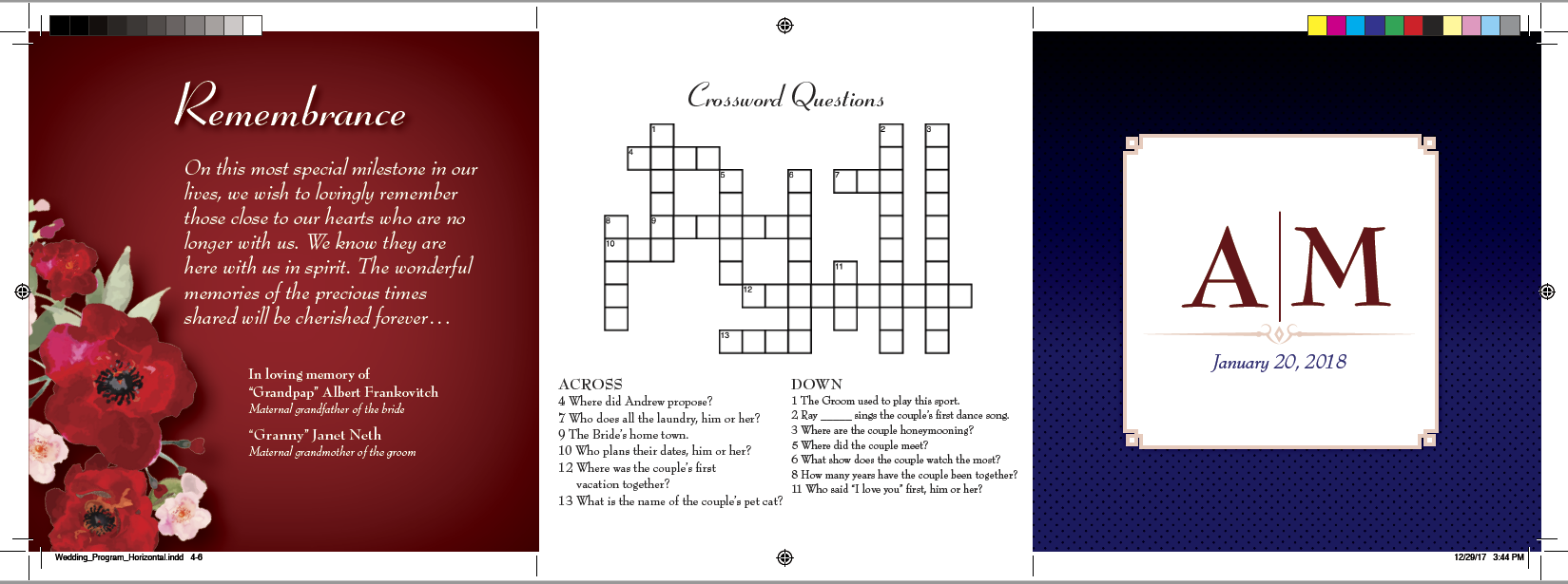
Well, this is the end of the tutorial, i want to show below what things look for me after selecting a font, adding a crossword puzzle and the monogram i created in adobe illustrator. I am happy to answer any questions you may have.
